Seeing Beyond the Top of Book
Having the ability to visualize an order book at depth provides traders, quants, and compliance officers with a level of understanding far beyond what is possible from simply looking at trade prices, and best prices and spreads. New visualization and time series data handling techniques enable users to comprehend an order book at depth across time. They can see the evolution of the market, the dynamics of different market participants, and their trading strategies in action.
These tools are useful for anyone working at an e-trading desk, and are increasingly useful for ensuring best execution and regulatory compliance, since they enable people to understand market and participant behavior, and how they change over time, very quickly — in seconds (as opposed to hours or longer.) Users can visualize the order book at full depth in real time, look back at time series historical data to backtest algos and strategies, and investigate trade alerts with excellent efficiency.
There are four key challenges to displaying an order book with full depth:
We have a video here that shows how all this works in action.
Let's look at a visualization showing best bids and offers, and through them, the spread.
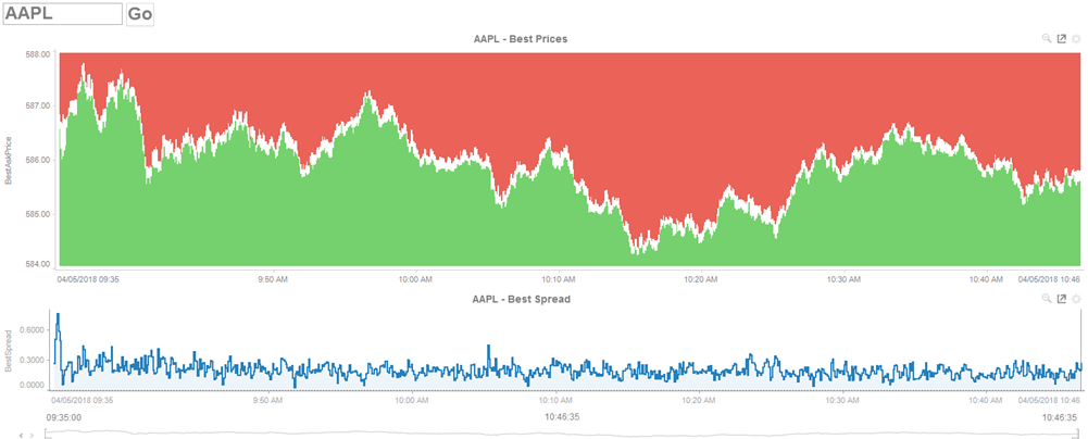
This is a good indication of price movement. As we know, strange things can sometimes happen with the spread, and if there is a significant size imbalance at best price, it can hides what is driving the price movement on both sides of the book.
When we drill down, we can see statistics for the book for the selected time period. In this case, we are grouping depth into ten buckets, and calculating size weighted stats within each bucket. We get a better understanding of the book, how the spreads widen with depth, how the sizes are imbalanced, and how they change with depth, and what the pricing looks like. We also see how all these factors change over the course of the trading day. We can see when the book widens, and when it narrows:
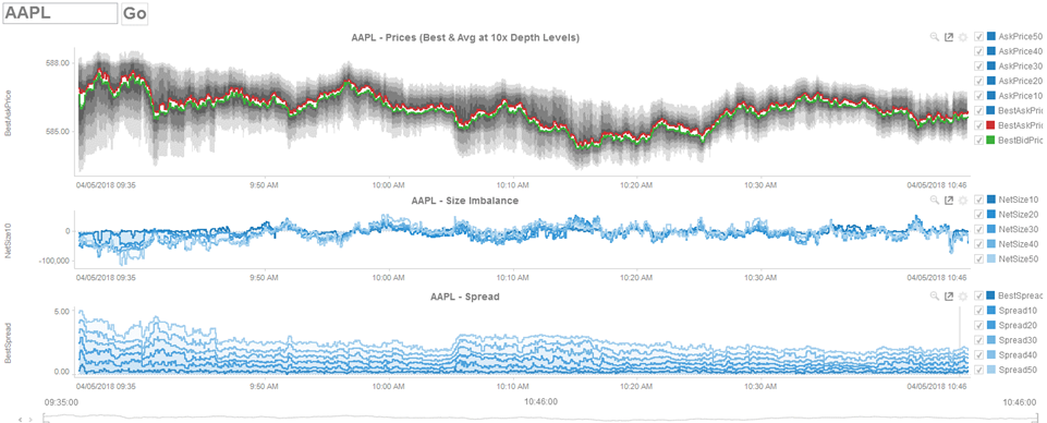
We can see the book widens and narrows, and how those changes are largely independent of the prices themselves: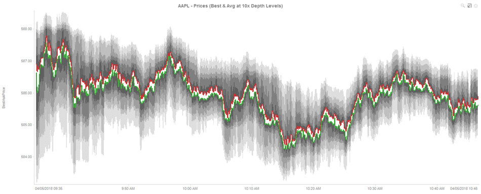
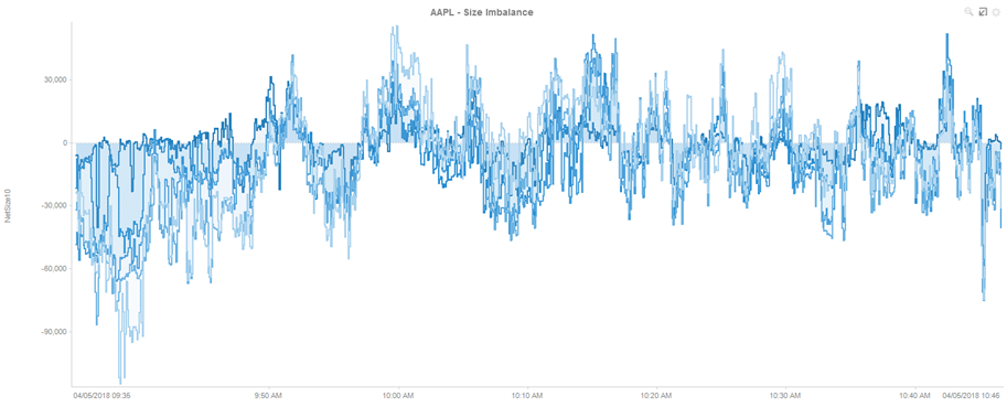
We can also see size imbalances, where the order book shifts between the bid and offer sides at specific levels or across the whole book:
We can also examine size-weighted spreads and see the impact of spreads widening at depth, which may be impossible to see at top of book. For example, at around 10:05 AM on this trading day, we can see a quick spike in the best spread, preceded by a widening of the spread at depth across all levels; this spike continued for several minutes:
These are still simplified views of the trading data. We cannot pick out suspicious activity at a specific price, although the statistics may be useful when we compare across instruments and across liquidity venues.
Generally, it's much more useful to visualize the full book. This allows us to watch the evolution of orders, and we can see activity on a tick by tick if we like:
We can use different visualization to help us answer different questions about the trading data.
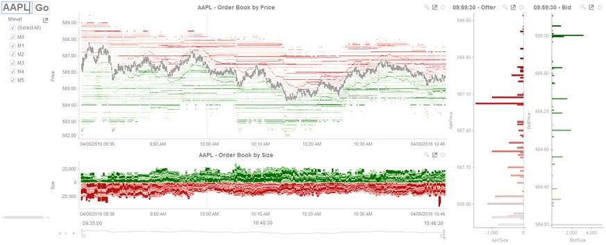
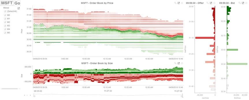
First, let's look at the top of book and focus on price. In this visualization, the Y axis is price, the X axis is time, and color represents the size (whether bid or offer) at the given price level. Best spread is colored grey. The book position is implied by how far away the price level is from the best spread. We see the price pattern and how size varies at that given price:
Next, let's look at size and book position. In this visualization, each price level is stacked from the midpoint, which represents the best pricing level. Height is the stacked, cumulative bid and offer size. Position in the stack is the book level. Color correlates to the proportion of the total size available at that point in time. We can easily identify large size at the top of book and size imbalances across the book. Is a market maker fulfilling his size obligations? Is there spoofing in the market? Is there a significant size imbalance close to being executed? Price data here is less important; we're focused on size and book position to help us answer those questions:
We can also see the order book ladder at any point in time and play through its evolution. Rather than wading through huge sets of data, we can start to pick out interesting behavior in a few seconds. For example, we can see larger orders away from the top of book, trading strategies tracking a moving average of the mid, and clustering of size near the best price. The key is to quickly understand and then drill down to full understand problems.
For example, if we compare trading of Apple to Microsoft on a particular trading day, we see completely different pictures of trading activity and spreads.:
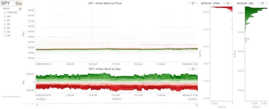
If we look at trading for an S&P 500 ETF, we see see a very spread out book, with a defined Poisson distribution for both sides of the book:
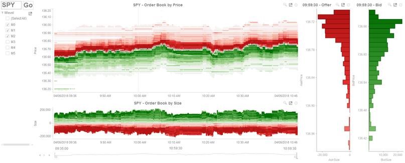
We focus on the top 20 levels, we see the majority of available size, as well as some kurtosis of the distribution, which seems to be due to orders again tracking the mid. We can combine the full depth displays with the statistical measures, and overlay key market events and trades. The result is a single window, where traders can quickly assess a position and determine what led up to it, something that's simply impossible using traditional data tables. Visually encoding the full book depth provides traders and managers with exceptional insight into their books:
Our video goes into even more detail. Watch it here.
These tools are useful for anyone working at an e-trading desk, and are increasingly useful for ensuring best execution and regulatory compliance, since they enable people to understand market and participant behavior, and how they change over time, very quickly — in seconds (as opposed to hours or longer.) Users can visualize the order book at full depth in real time, look back at time series historical data to backtest algos and strategies, and investigate trade alerts with excellent efficiency.
There are four key challenges to displaying an order book with full depth:
- The data can be in the wrong format: For example, it may be a simple set of order events (new, replace, cancel / trade) that must be reconstructed into an order book.
- The data volumes can be huge: Dashboards used by traders and compliance people must be highly responsive, since the users must be able to react to market events and interact with the dashboard in real time, without distracting delays. This enables them to change perspectives and focus on key trading patterns, levels, and market participants effectively.
- Screen real estate: There are just not enough pixels on a screen to display all the available data. The trick is developing visualization techniques that make highly efficient use of the available space and allow users to see the big picture and also the smallest details in one dashboard.
- Human comprehension: Users can be visually overwhelmed by so much data changing so rapidly. Without the right kind of visualizations and the right set of filters, they can miss real problems and opportunities all too easily.
We have a video here that shows how all this works in action.
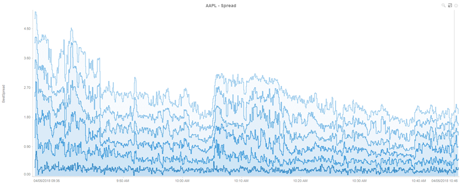
Let's look at a visualization showing best bids and offers, and through them, the spread.
This is a good indication of price movement. As we know, strange things can sometimes happen with the spread, and if there is a significant size imbalance at best price, it can hides what is driving the price movement on both sides of the book.
When we drill down, we can see statistics for the book for the selected time period. In this case, we are grouping depth into ten buckets, and calculating size weighted stats within each bucket. We get a better understanding of the book, how the spreads widen with depth, how the sizes are imbalanced, and how they change with depth, and what the pricing looks like. We also see how all these factors change over the course of the trading day. We can see when the book widens, and when it narrows:
We can see the book widens and narrows, and how those changes are largely independent of the prices themselves:
We can also see size imbalances, where the order book shifts between the bid and offer sides at specific levels or across the whole book:
We can also examine size-weighted spreads and see the impact of spreads widening at depth, which may be impossible to see at top of book. For example, at around 10:05 AM on this trading day, we can see a quick spike in the best spread, preceded by a widening of the spread at depth across all levels; this spike continued for several minutes:
These are still simplified views of the trading data. We cannot pick out suspicious activity at a specific price, although the statistics may be useful when we compare across instruments and across liquidity venues.
Generally, it's much more useful to visualize the full book. This allows us to watch the evolution of orders, and we can see activity on a tick by tick if we like:
We can use different visualization to help us answer different questions about the trading data.
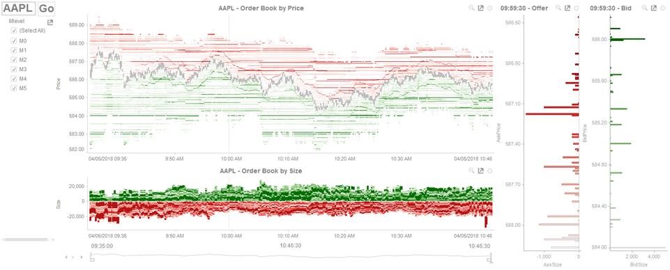
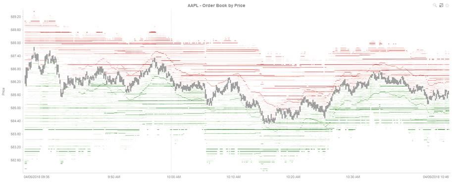
First, let's look at the top of book and focus on price. In this visualization, the Y axis is price, the X axis is time, and color represents the size (whether bid or offer) at the given price level. Best spread is colored grey. The book position is implied by how far away the price level is from the best spread. We see the price pattern and how size varies at that given price:
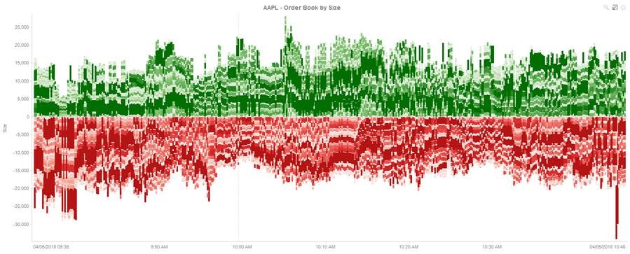
Next, let's look at size and book position. In this visualization, each price level is stacked from the midpoint, which represents the best pricing level. Height is the stacked, cumulative bid and offer size. Position in the stack is the book level. Color correlates to the proportion of the total size available at that point in time. We can easily identify large size at the top of book and size imbalances across the book. Is a market maker fulfilling his size obligations? Is there spoofing in the market? Is there a significant size imbalance close to being executed? Price data here is less important; we're focused on size and book position to help us answer those questions:
We can also see the order book ladder at any point in time and play through its evolution. Rather than wading through huge sets of data, we can start to pick out interesting behavior in a few seconds. For example, we can see larger orders away from the top of book, trading strategies tracking a moving average of the mid, and clustering of size near the best price. The key is to quickly understand and then drill down to full understand problems.
For example, if we compare trading of Apple to Microsoft on a particular trading day, we see completely different pictures of trading activity and spreads.:
If we look at trading for an S&P 500 ETF, we see see a very spread out book, with a defined Poisson distribution for both sides of the book:
We focus on the top 20 levels, we see the majority of available size, as well as some kurtosis of the distribution, which seems to be due to orders again tracking the mid. We can combine the full depth displays with the statistical measures, and overlay key market events and trades. The result is a single window, where traders can quickly assess a position and determine what led up to it, something that's simply impossible using traditional data tables. Visually encoding the full book depth provides traders and managers with exceptional insight into their books:
Our video goes into even more detail. Watch it here.